travel the world worry free!
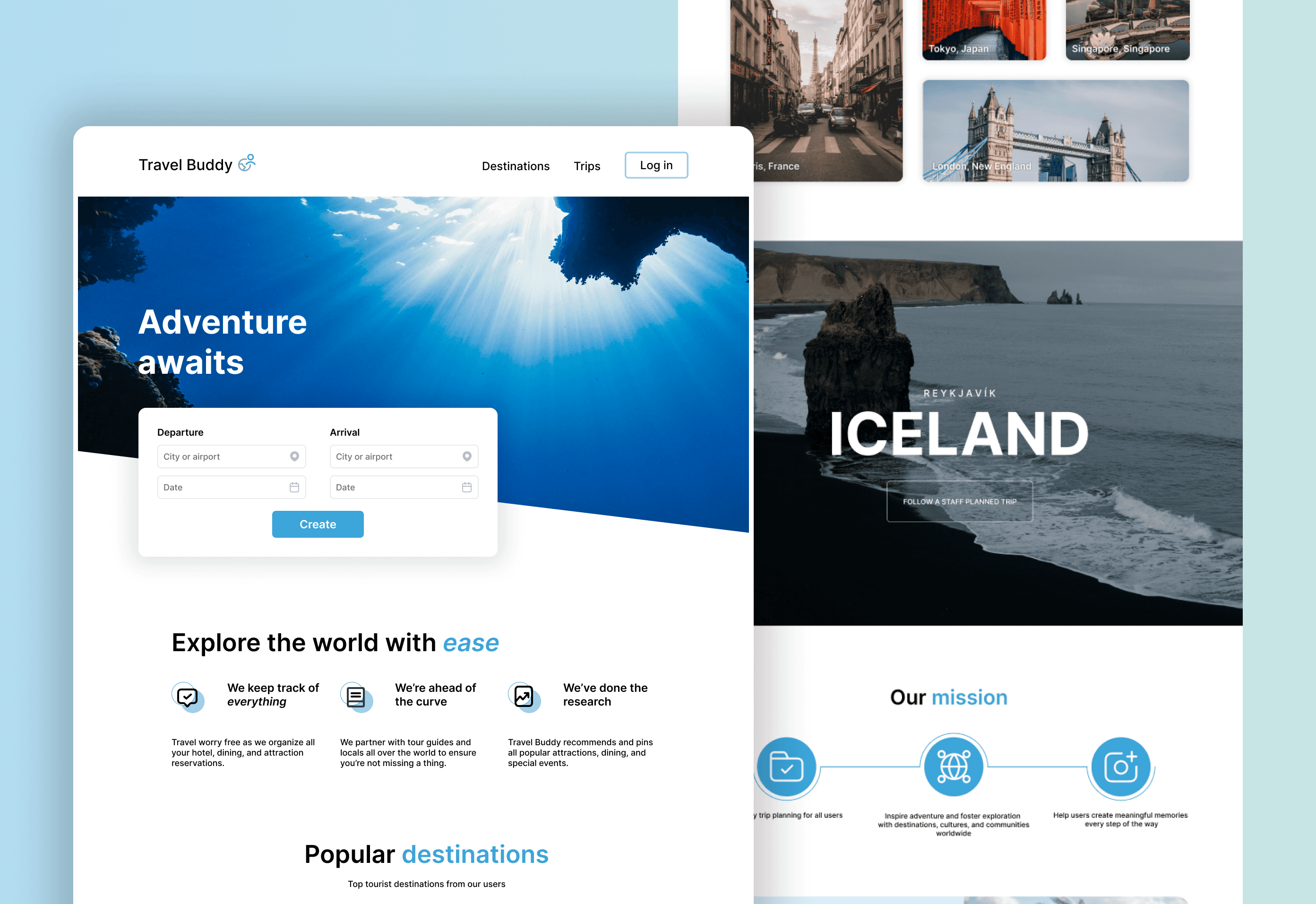
Travel Buddy helps users manage trips by keeping track of flights, hotel stays, and all reservations made. In doing so, users are able to spend more time enjoying their vacation. Travel Buddy aims to provide an experience that is user-friendly, convenient, and helpful.

Week 1: user research and analytics
Week 2: user testing and wireframes
Week 3: mid fidelity designs
Week 4: testing
Week 5: final designs
User research and analytics
User testing
Wireframes
Interactive prototypes
UI and UX design
project process + flow
Travel Buddy is centered on helping users plan and manage trips, so it was crucial to understand what constitutes a successful trip. To do so, I conducted user research and from travelers on their current experience and process with trip planning. By focusing on understanding user needs and current pain points, I was able to create a user-centered design approach that truly aimed to address user needs.
user research and analytics
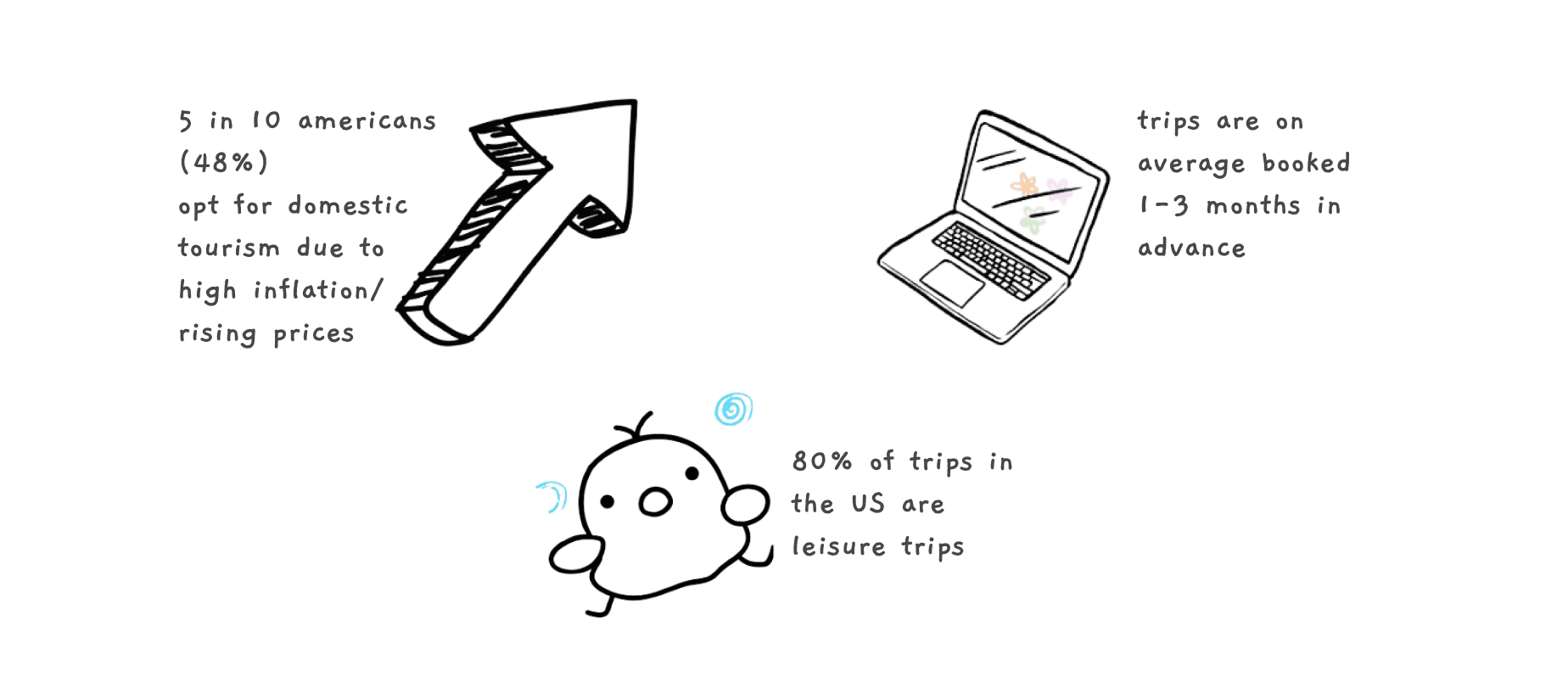
I studied data from the US Travel association and Bureau of Economic Analysis to understand travel behavior and trends. These were some insights that helped me understand travel behavior and mindset when creating Travel Buddy.
flight
The intention behind this journey map was to visualize and understand a potential user's experience and further see potential pain points and concerns.
sitemap design
design
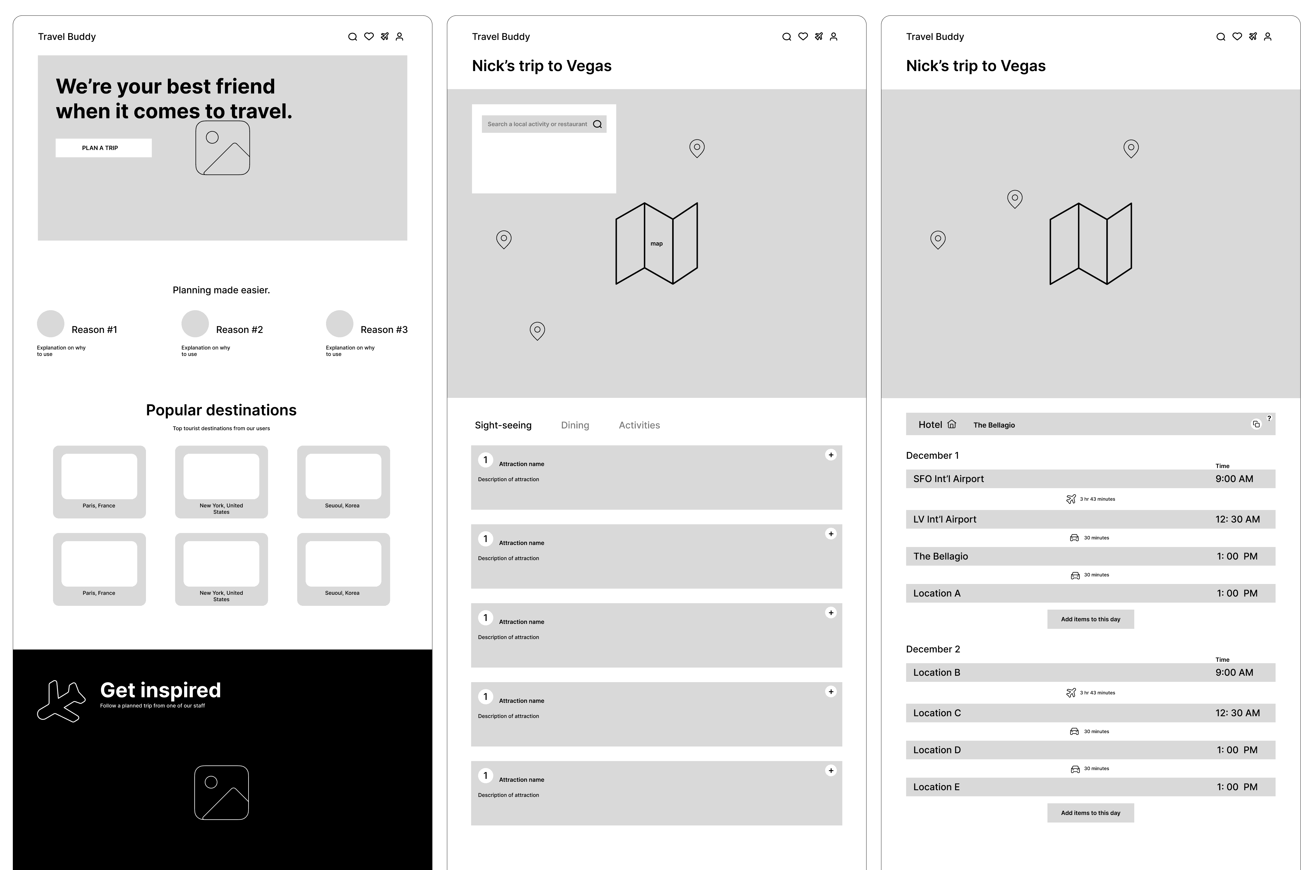
wireframes
create trip
I tested out various ways to display the calendar when creating a trip, using different sizes and items a user can input. I initially did not think adding a return location was necessary, but after user feedback decided to as it helped the design feel more complete. I feel the final design is cleaner, more intuitive, and provides a smoother experience.
itinerary selection
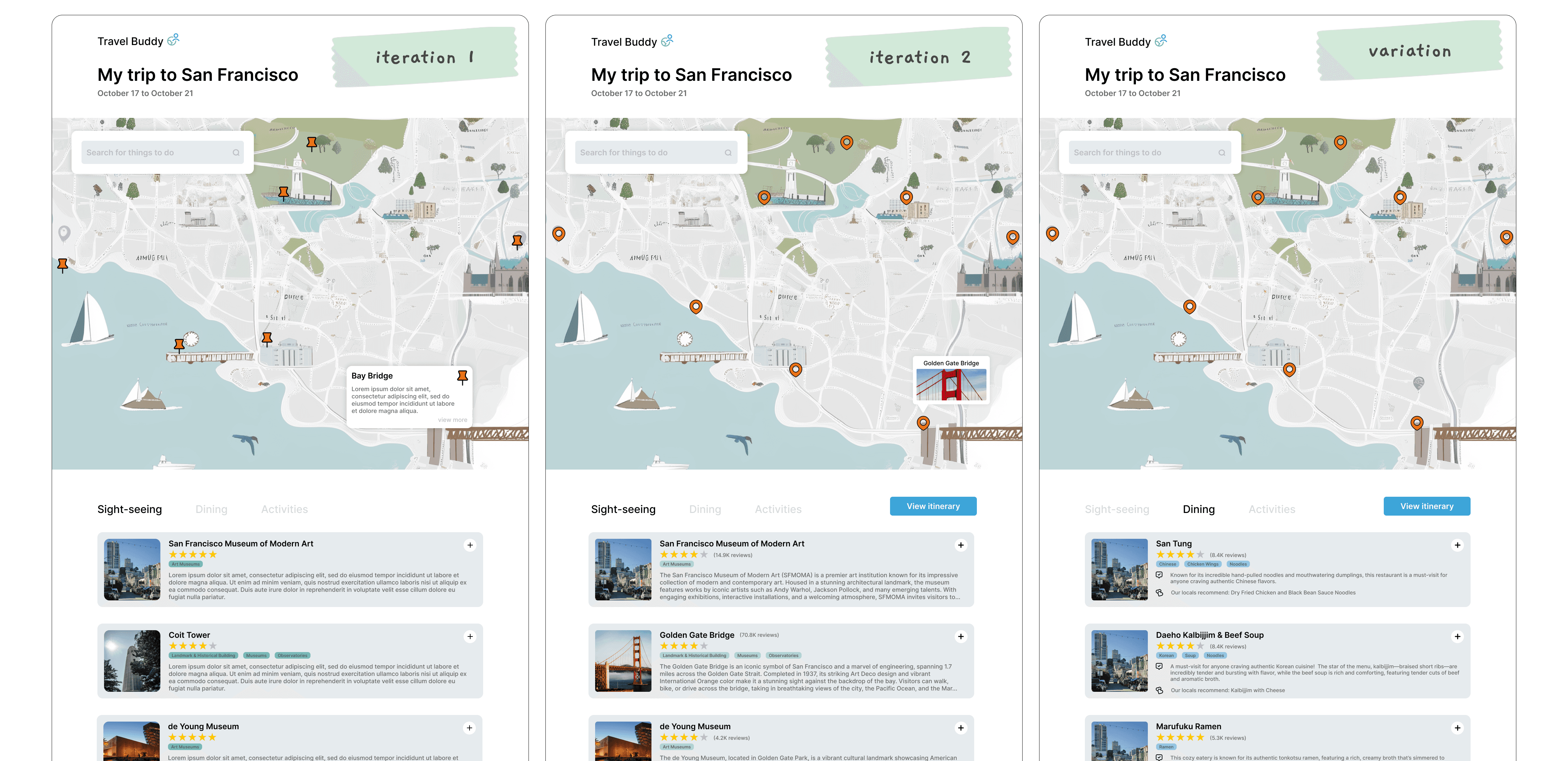
Based on user testing, I felt all trip items could be categorized into sight-seeing, dining, or activity items. From the selection screen, I also decided to incorporate a button for users to view what had been added. From early testing, users felt this layout was easiest to navigate.
itinerary
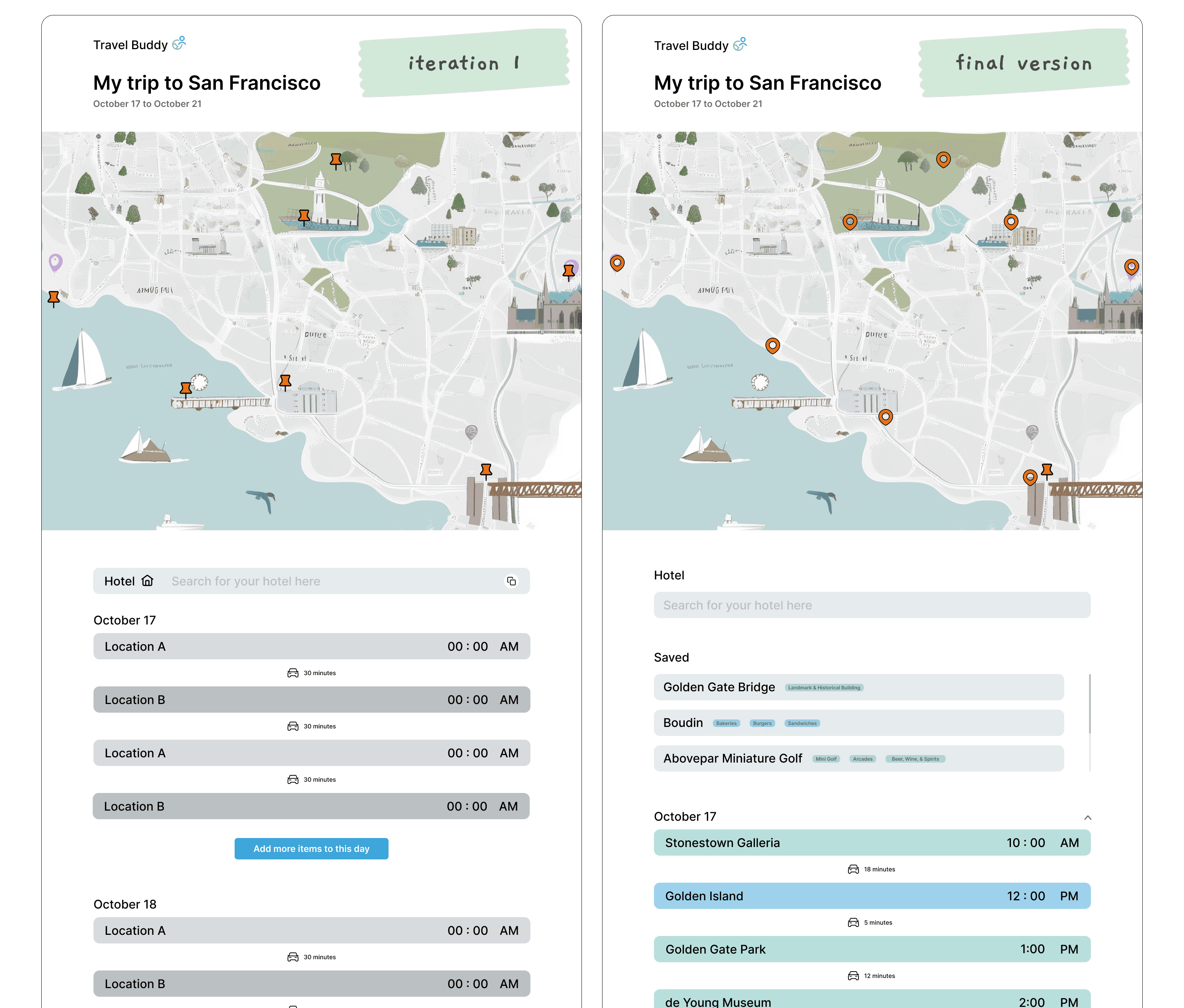
For the itinerary, I wanted users to be able to easily add and move things around in the day. Based on user feedback, I opted to switch from a separate editing mode to a drag and right click to delete function. I also incorporated 2 new features (displaying saved items and minimizing dates) to better user experience.
landing
Working on creating a website from end-to-end was very interesting for me as I had to consider new ways users would be interacting that I had not before. Additionally, in this project I was able to employ new design techniques to help make my own personal process more efficient.
I personally struggled with deciding how to create the itinerary screens. If I had more time or resources, I would have liked to test our variations on how a user can arrange their itinerary. Besides this, however, I am still excited to have completed this project!
